
How to Optimize Photos for Your Website
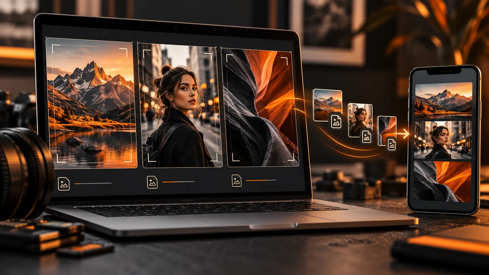
Photography website image optimization means publishing photos at a useful display size, choosing an appropriate format and checking that compression preserves the details that matter. The goal is a portfolio that feels responsive while still representing your work accurately—not the smallest file at any cost.
Start with a representative gallery rather than changing your whole library at once. This guide explains how to prepare images and test the results. If you are building the wider site, our photography website setup guide covers the broader structure.
Separate your originals from your website exports
Keep original files and print-ready versions outside the public website workflow. A web export is a delivery copy, not your archive. Save a repeatable export preset, but check it against different kinds of photographs before applying it to every image.
A portrait with smooth background tones, a forest with fine detail and a high-contrast architecture photograph can respond differently to compression. Use examples that represent your actual portfolio. Keep the original available so you can re-export if the first version loses texture, introduces banding or looks soft.
Choose dimensions for where the photo appears
There is no universal pixel width that suits every photography site. A full-width landscape, a three-column gallery tile and a portrait on a phone have different needs. Your platform may also generate several sizes and serve different versions to different screens.
Start with the actual layout
Check the largest intended display area. A small gallery thumbnail does not usually need the same source dimensions as a photograph that opens in a large lightbox. Conversely, an export that looks sharp in a grid may look soft after enlargement.
For a practical starting point, prepare a version appropriate to the platform’s guidance, then test the grid and enlarged view on a normal desktop and a high-density phone. Do not treat an example dimension from a tutorial as a requirement for every image.
Follow platform guidance without turning it into a universal rule
Squarespace’s own image-formatting guidance recommends widths for its platform and explains how it handles display. Those recommendations are useful for Squarespace; they are not automatic specifications for WordPress or every gallery plugin. Check the guidance for the system you actually use.
Pick a format that suits the photograph and the platform
JPEG remains a practical option for photographic images. WebP and AVIF can provide efficient web delivery where the platform supports them. PNG is more appropriate when transparency or particular graphic requirements justify it; it is not the default choice for a large photographic portfolio.
The right decision is based on compatibility and visible quality. If a platform automatically creates modern delivery versions, find out whether you need to prepare them yourself. Avoid running an image through multiple lossy compression tools without inspecting the result.
Compare at the size visitors will see
Export two versions with different quality settings. Compare faces, fine textures, edges and smooth gradients at the displayed size. A difference that is invisible at normal viewing size may not justify a much larger download, while visible banding or damaged detail is a reason to increase quality.
Do not chase a fixed file-size limit for every photograph. A detailed hero image and a simple thumbnail may need different budgets. If a page feels heavy, review the number of images and their layout as well as individual files.
Plan crops before uploading
Gallery widgets often crop images to a consistent ratio. That can be useful visually, but it may cut off a subject’s head, important architectural lines or the edge of a composition. Review the crop settings and focal point through your platform’s visual controls.
- Check the desktop grid and the mobile grid.
- Check any lightbox or expanded view separately.
- Use an intentional crop for hero banners.
- Keep a full composition available when it matters to the work.
- Do not stretch a portrait into a landscape container.
If your template offers several gallery formats, compare them with your real photographs. Our photography website template guide is a starting point for thinking about presentation; test the chosen format rather than relying only on a demo.
Check responsive delivery and loading behaviour
A mobile visitor should not have to download a desktop-sized original for a small thumbnail. Many website systems generate responsive image sizes, but plugins, backgrounds and embeds may behave differently. Check the actual published page, not only the Media Library thumbnail.
Prioritize the first visible photograph
The image at the top of the page is part of the first impression. Loading settings should not delay it unnecessarily. Images farther down a long gallery can often load later, provided they appear reliably when the visitor reaches them. Use the platform’s supported settings and test the result.
Do not overload the first gallery view
A carefully edited selection can be easier to review than an entire archive. If a page contains many large photographs, compression alone may not solve the problem. Group work by a useful project or category and check whether the gallery’s existing pagination or loading controls suit the visitor’s task.
Write alt text from the actual photograph
Alt text describes the image in its context. It is not a place to repeat “photography website design” across the whole gallery. Write what a visitor needs to understand about the photograph, including relevant subjects or context when they are genuinely known.
For example, “Couple walking across a beach at sunset” describes an image without inventing a location or client. If a caption already explains the subject, consider how the alt text and caption work together. Decorative images may need empty alt text; important portfolio photographs usually need a useful description.
Use a descriptive filename before uploading, but do not rename files solely to insert every keyword. Avoid putting private client details into filenames or descriptions without permission.
Test a representative gallery before changing everything
- Record the current appearance and keep original exports.
- Select a small set of representative photographs.
- Prepare revised exports at appropriate dimensions and quality.
- Upload them through the normal media controls.
- Check the crop, sharpness and enlarged view.
- Open the page on a phone and a desktop.
- Confirm no image is broken, stretched or wider than the page.
- Compare loading with a repeatable test and note the conditions.
A single speed-test score is not a complete assessment. Network conditions, cache state and third-party scripts can change results. Check the experience as well as the test output, and distinguish laboratory tests from real-user performance data.
A photographer’s image handoff checklist
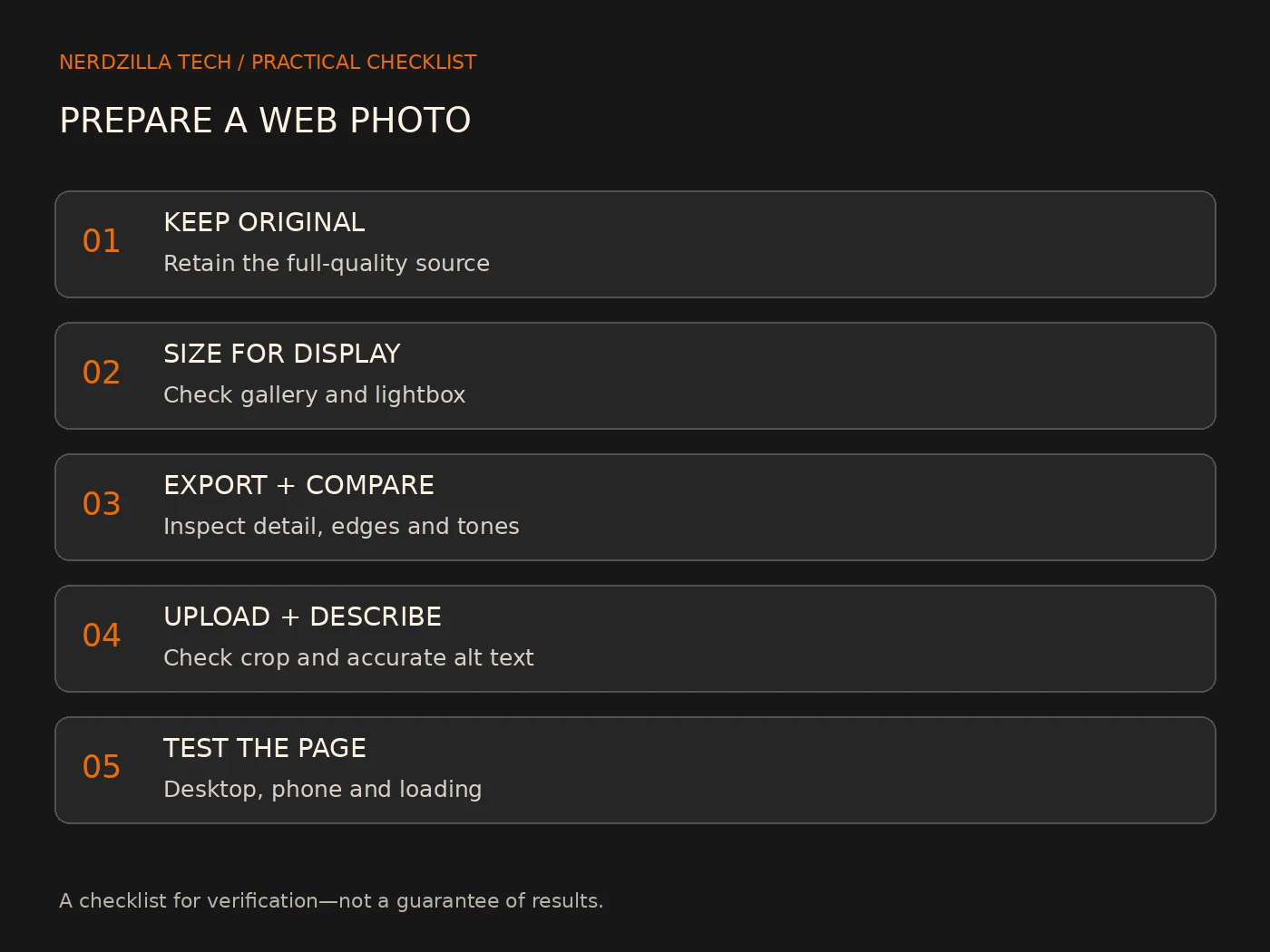
If a designer or developer is preparing your site, provide the intended display context, original or approved web exports, preferred crops and permission to show the work. Explain whether visitors need a lightbox, proofing gallery, download or print-quality file; those are different delivery requirements.
- Identify hero images separately from gallery images.
- Mark photographs that must retain their complete composition.
- Provide accurate captions and subjects for alt text.
- State what may be displayed publicly.
- Confirm who maintains future uploads and export presets.
Frequently asked questions
What is the best image size for a photography website?
It depends on the largest display size, the gallery’s enlarged view and the platform’s processing. Use platform guidance as a starting point, then test representative photographs on desktop and mobile. Avoid publishing a full-resolution original when a suitable web export meets the need.
Should I use WebP instead of JPEG?
Use it when your platform supports it and the result preserves the photograph at an appropriate file size. Some platforms convert images automatically. Compare actual exports and delivery before changing the whole library.
Will compression ruin my portfolio?
Heavy compression can visibly damage an image. Moderate settings may preserve what visitors can see at the displayed size. Compare representative photographs and retain originals so you can revise the export.
Do watermarks prevent copying?
No. A watermark may discourage casual reuse, but it does not prevent copying. Publish only work you have permission to show and decide how you want to balance presentation with your rights-management needs.
Keep the work sharp and the workflow repeatable
Begin with the layout, export a suitable version and judge it at the size visitors see. Then test loading, crops and accessibility before repeating the workflow across the portfolio.
For help with gallery presentation and the wider enquiry journey, see our photography website design service or discuss your photography website. Share the platform and gallery requirements you already have so we can discuss a relevant scope.
3 Replies to “How to Optimize Photos for Your Website”
How to Make a Photography Website: A Step-by-Step Guide
[…] website easy to find online. Use the right words in your content and tags. Also, make sure your pictures load fast. This boosts your site’s search rank and makes it appealing on all […]
Elementor Photography Website Design | NerdZilla
[…] Elementor, I can use meta tags, optimize images, and add schema markup. These tools boost my website’s search rankings and draw in more […]
Photography Website Templates - Build a Stunning Online Portfolio
[…] these photography website templates look great on retina displays. They ensure that my high-res images pop with vivid details. This feature really amps up the attractiveness of my visual artist […]