
Nonprofit Donation Page Best Practices: Make Giving Clear and Test the Journey

A nonprofit donation page should explain what a gift supports, make the amount and payment frequency clear, and guide the donor through a reliable payment and confirmation process. A prominent Donate button is useful, but it cannot compensate for a confusing form or missing receipt.
This guide covers the donation journey, from the page message to a test receipt. It does not assume that every organization can use the same provider or claim the same tax treatment. For the wider site setup, see our nonprofit website creation guide.
Explain what the donation supports
Give visitors a concise, specific reason to donate. Describe the program or purpose accurately and use photographs you have permission to publish. If donations go into a general fund, say so rather than implying each gift is restricted to a particular project.
For example, “Your donation supports our community learning program” is clearer than “Change everything today.” If you show an amount beside an impact statement, the organization must be able to substantiate that relationship. Do not invent a cost-per-person figure to make a card look persuasive.
Keep the page message and form consistent
If the page describes a specific appeal but the payment form names a different campaign, a visitor may question whether the donation goes to the intended place. Check campaign names, organization names and any restrictions across the page, checkout and receipt.
Make one-time and recurring gifts easy to distinguish
A donor should understand whether the payment happens once or repeats. Label the frequency near the amount and repeat it in the final review and confirmation where the provider supports it. Avoid relying on a small switch or an ambiguous preselected option.
If you offer recurring gifts, explain how donors can manage or cancel them through the actual provider process. Do not promise a donor portal or automatic cancellation route unless it exists and has been tested.
Offer useful amounts without pressure
Suggested amounts can simplify the choice, but include a custom amount when the tool allows it and the organization’s policy supports it. Make the selected amount visually clear. Explain any optional contribution to the platform or processing cost so it cannot be mistaken for the organization’s donation.
For illustration, a form might show three suggested amounts and an “Other amount” field. The actual amounts should follow the organization’s fundraising plan, not a generic web-design template.
Ask for information you genuinely need
Every required field should have a purpose. Some details may be needed for the payment provider, receipts, organizational records or applicable requirements. Others may only be useful for optional engagement. Review the distinction rather than removing necessary fields or making every available field compulsory.
- Label required and optional fields clearly.
- Explain why an unusual field is needed.
- Keep email updates separate from the donation itself where appropriate.
- Link to your published privacy information.
- Do not collect card information through a general contact form.
The payment provider should handle payment details through its supported checkout. Decisions about legal disclosures, consent and record keeping need the organization’s own approved requirements.
Choose a hosted donation page or an embedded form
A hosted page takes the donor to the fundraising provider’s page. An embedded form keeps the payment interface inside your website. The better choice depends on mobile behaviour, provider support, maintenance and the organization’s operational needs.
Hosted page
A hosted page can reduce the amount of website integration you maintain. Make the destination clear, preserve recognizable organization details and test the return or confirmation journey. An off-site checkout is not automatically a problem if the transition is understandable.
Embedded form
An embed can create a more continuous experience, but check its loading, height, error messages and mobile width. The entire form must fit without making the page scroll sideways. If the provider does not offer a suitable visual setting, use its supported hosted option rather than squeezing the form into unreadable text.
For examples of provider-specific choices, Donorbox’s donation page guide discusses donation forms, mobile use and recurring gifts. Compare those features with your own requirements; a vendor guide is not proof that one provider is right for every organization.
Build trust with verifiable information
Show the organization’s correct name, contact route and relevant public information. If registration details, financial reports or policies are appropriate, link to the current documents. Use real testimonials or impact stories only with permission and accurate context.
A padlock, payment logo or reassuring phrase does not establish nonprofit status or tax deductibility. Do not describe a donation as tax deductible unless the organization has verified the applicable conditions. Keep provider and security descriptions within what you can substantiate.
Design the mobile journey around the donation task
Check the page on a real phone where possible. The purpose should be clear before the form begins, and buttons should remain readable without covering fields. Large banners, pop-ups or floating elements can make a simple donation unnecessarily difficult.
- Test amount selection and custom entry.
- Check the one-time/recurring choice.
- Read field errors without zooming.
- Check payment options available in your region.
- Make sure the keyboard does not hide the next step.
- Confirm the page stays within the screen width.
Payment methods and provider availability vary. Do not advertise an option on the page until you have confirmed it works for the organization’s account and intended donors.
Test payment, confirmation and receipts separately
Use the provider’s sandbox or test mode where available. Test-mode behaviour is useful, but it does not prove a live account is ready to accept payments. If a live test is required, the organization should authorize the amount and complete the transaction using its normal financial controls.
Before the test
Confirm who owns the payment account, who receives notifications and who can resolve failed transactions. Check that you are testing the intended campaign and environment. Avoid leaving a test form or sandbox checkout connected to the public Donate button.
During the test
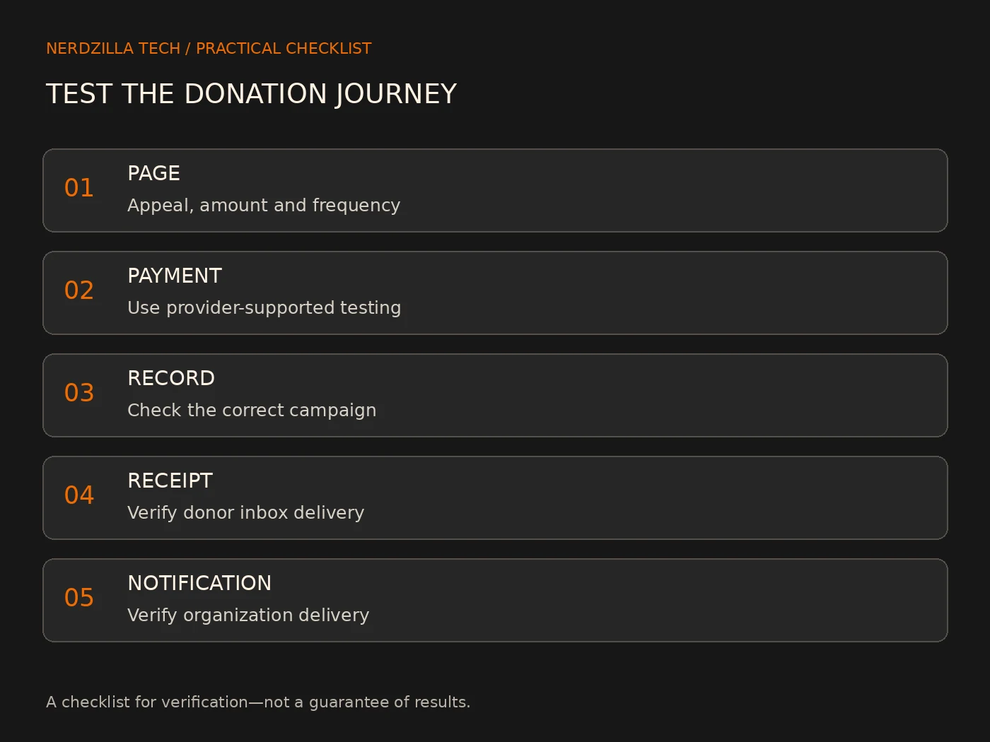
- Open the Donate link from the public website.
- Choose an amount and frequency.
- Complete the provider’s supported test flow.
- Check the on-screen confirmation and next step.
- Confirm the donation record appears in the correct dashboard.
- Check the donor receipt arrives, including spam.
- Check the organization’s notification arrives.
- Verify the campaign, amount and frequency match throughout.
Do not repeat a payment merely because an email is delayed. First check the provider’s transaction record to avoid an accidental duplicate donation. A successful payment and a delivered receipt are separate checks.
Keep a clear maintenance owner
Decide who updates campaign wording, checks the payment account and reviews delivery failures. Repeat the key tests after changing a donation plugin, provider, domain, email account or form. Keep access with the organization rather than depending on one person’s private account.
Record the public donation link, provider account owner, receipt settings and support route in an internal handover. This is operational information, not content to publish on the donation page.
Donation page launch checklist
- The appeal accurately describes the use of gifts.
- The organization and campaign names match throughout.
- The amount, currency and frequency are unmistakable.
- Required fields have a real purpose.
- Policies and contact details are current.
- The mobile checkout fits and is readable.
- Payment records, confirmation and receipts have been tested.
- A responsible person can maintain the system and help donors.
Frequently asked questions
Should the donation form be on the website?
It can be embedded or hosted by a provider. Choose the supported option that works reliably for your organization and donors. Test the transition and mobile experience rather than assuming an embed is always better.
Should monthly giving be the default?
Whatever default you choose, donors must clearly understand the frequency before completing payment. Avoid a design that makes a recurring commitment easy to miss.
What should the thank-you page include?
Confirm the donation status, explain the receipt or next step and provide a contact route. Use wording that matches what the payment provider has actually confirmed.
Can I say every donation is tax deductible?
Not without verified organization-specific and jurisdiction-specific information. Obtain approved wording from the organization or its qualified adviser instead of copying a claim from another nonprofit’s website.
Make giving clear before adding more features
The strongest starting point is a truthful appeal, understandable choices and a tested payment-to-receipt journey. Fix uncertainty and delivery problems before adding decorative elements or more fields.
If your organization needs help with the website around its donation process, explore our nonprofit website design service or discuss your nonprofit website. Share your existing donation provider and requirements so we can discuss what is actually needed.