
Peptide Product Page Design: Specifications, Lab Reports and Buyer Clarity
The product page is where visitors decide whether they have enough information to continue. In a research peptide catalog, a dramatic image and a purchase button cannot answer every question. Useful peptide product page design puts the correct specifications, documents and ordering details in a predictable place.
Start with identification, not decoration
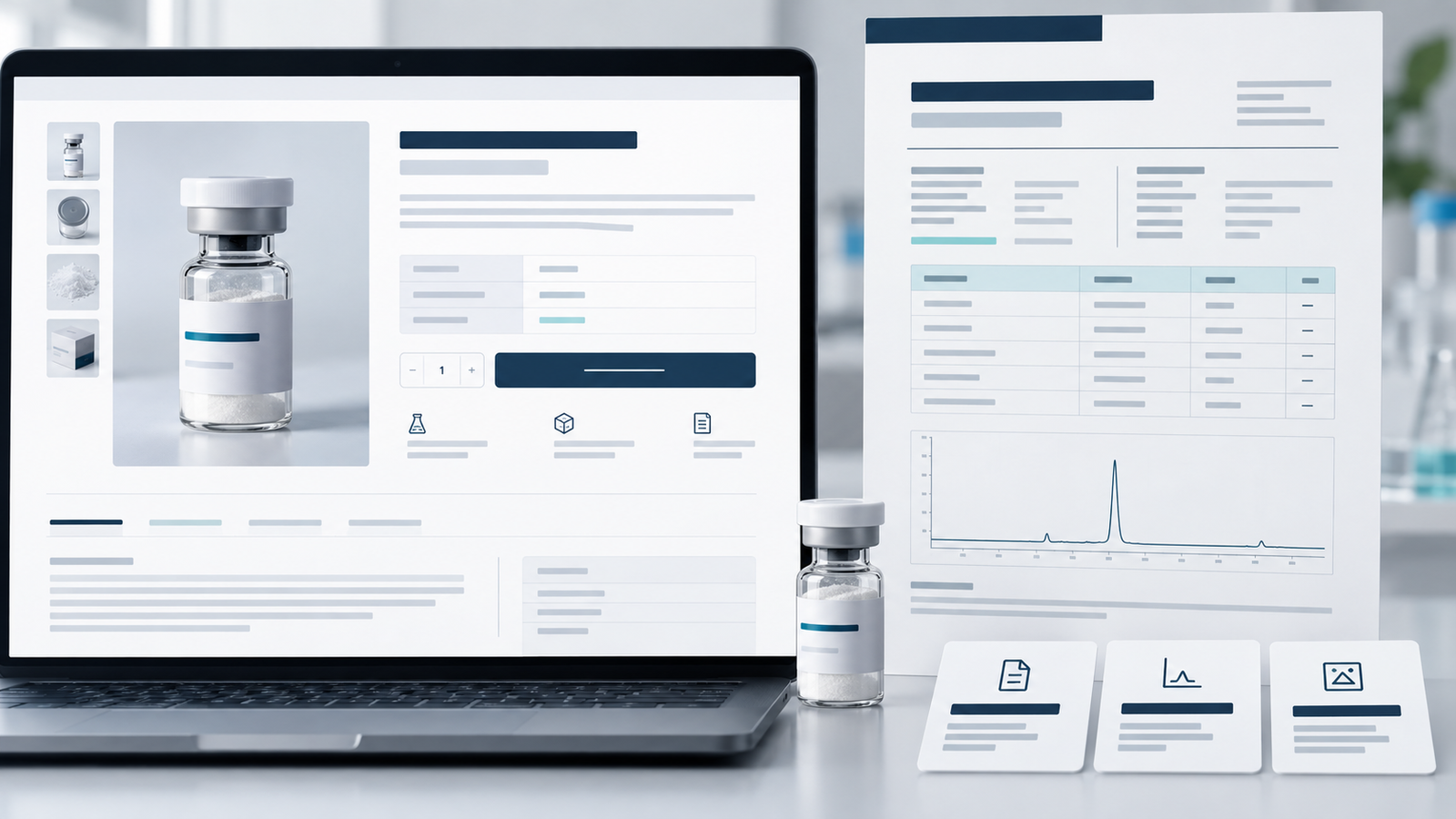
Put the product name and available options where visitors see them first. Use images that represent the actual item or clearly label conceptual visuals. If several variations share a page, make the selected option and its details obvious. This helps prevent confusion between products that look similar.
Show specifications in a scannable product page layout
Short labeled rows are often easier to use than a dense paragraph. Decide which fields matter for the real catalog and use them consistently. Do not populate a field with a default value simply to make the layout look complete; the business must verify the information supplied for each item.
Link the correct lab document
If the seller publishes certificates of analysis or other testing documents, label each file clearly and connect it to the relevant product and batch where applicable. Visitors should not have to compare filenames in an unrelated library to work out which report they need. Show when a document is unavailable instead of implying it exists.
Keep claims and intended use accurate
Product copy should match verified business information and the intended market. Avoid presenting research products as treatments or using unsupported outcome claims. Appropriate product classification, claims and selling requirements require review by the business and qualified advisers; a design agency cannot establish them through page styling.
Answer practical ordering questions
Before visitors reach checkout, give them an easy way to find availability, shipping information, payment options, returns and a working contact route. Display only payment methods actually approved and configured for the store. Unexpected restrictions late in checkout create confusion.
Test the page on a phone
Long tables, image galleries and document links can work on desktop and fail on mobile. Check whether specifications wrap cleanly, options are easy to tap, documents open correctly and the primary action remains visible without covering key information.
Peptide product page design that reduces guesswork
Think of the page as a sequence of questions. First: which item is this? Next: which option am I looking at? Then: what information supports the listing, what are the ordering conditions, and what action can I take? Put the product name and option selector near the top, followed by a concise specification table, relevant documents, shipping or ordering details and a contact route for unresolved questions. Avoid making visitors scroll past generic brand claims before they can identify the item.
How to handle batch documents on peptide product pages
| Situation | Clear page behavior |
|---|---|
| One current report | Label it with the relevant product and batch reference. |
| Several batches | Let visitors select or identify the batch before opening a report. |
| No report supplied | State that a report is unavailable; do not show an unlinked verification badge. |
| Old report replaced | Prevent an old file from appearing to describe current stock. |
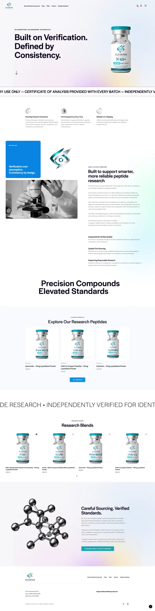
The current Elevated Compound website presents a COA database route and explains a browse, verify, policy sequence. The current Advanced Peptides Australia website also makes lab-test access a prominent route. Both appear in our portfolio. Their visible approaches are useful examples of how documentation can be made findable, although the seller remains responsible for the accuracy of each report.
Five peptide product page design checks before launch
- Compare the displayed name, option and specification against the approved product record.
- Open every document link and confirm that its reference matches the item or batch.
- Test the unavailable-option and out-of-stock states.
- Read the page at phone width, including tables and file links.
- Confirm that the next step, policies and contact route all work.
This review is more valuable than repeating the same reassurance badges on every page. A visitor can verify a clear record and working link; a decorative claim alone gives them little to check.
Make the template maintainable
Whether a store uses WooCommerce or another platform, separate product data from layout so updates stay consistent. Define who will revise descriptions, replace documents and check links when inventory changes. The best page template is one the team can maintain accurately.
NerdZilla Tech’s peptide web design portfolio includes projects such as Elevated Compound and Peptalk Labs. For a store or product-page redesign, contact us with your current catalog and documentation workflow.
Portfolio example: Elevated Compound
Continue planning your peptide website
For the wider site structure, use our peptide website design checklist. If you are building the store on WordPress, read the WooCommerce peptide ecommerce guide.
2 Replies to “Peptide Product Page Design: Specifications, Lab Reports and Buyer Clarity”
Peptide Ecommerce Website With WooCommerce | NerdZilla
[…] with the peptide website design checklist, then review the product-page and lab-report guide for the details each listing […]
Peptide Website Design Checklist | NerdZilla Tech
[…] how the WooCommerce peptide store guide handles product structure, and use our product-page documentation guide to plan each […]